Showing posts with label Printing. Show all posts

Tuesday, October 30, 2012

Hey Frame Makers… What about the 2/3rds of us?

Last Monday I mentioned I’m working on a special print project for charity and have been ironing out a few details, one of which was framing.  It isn’t my intent to sell the print framed, but I also don’t want to make it difficult for the buyers to find framing options either. 

If you shoot with a cropped sensor camera and have tried to find frames to match your native print sizes, you already appreciate the dilemma.  Traditional full frame cameras capture images at a height to width ratio of 4:5 while cropped sensors are 2:3.  That means the “traditional” frame sizes of 8 x 10, 16 x 20, etc., leave something to be desired for us “non-traditional” folks.

Cropped sensor (or DX) type cameras are not new.  Most DSLR manufactures have been producing them forever as they are cheaper to produce and there are millions and millions and millions of people using these types of cameras.  So where are our 2:3 ratio frames?  I’ve performed this exercise before, but I thought maybe the times would have changed and I set out to find a 16x24 frame in my local area.  After stopping at 2 nationally known retailers and 2 more large specialty craft stores, I found exactly 1 option – a simple black frame.

So what are our options in this 2:3 discriminatory world?  There are 3 that I came up with.

  1. Stay true to your “artistic vision” and let the buyer worry about how to frame it.
  2. Sell out and crop your image to make the traditional frame makers happy, or
  3. Add a border to your image to bring it up to a traditional frame size.

Here’s my original 2:3 ratio image:

… and here it is cropped to 4:5:

For this particular image where I’m fading to black on the borders, it’s more of a subtle difference as I’m not really loosing any of the image.  If it were a nice edge-to-edge landscape or something of that nature, then you have no choice but to make some difficult decisions.  Even so, I still prefer my original 2:3 interpretation of the “Still Watchful” image.  That leaves me with option 3, add a border.

In this case I moved up to a 20x30 print size by adding 3 inches to the left and right, 1.5 inches to the top and 2.5 inches to the bottom using the extra space on the bottom to include title/series/artist information.

There. I’m back to being a conformist frame makers.  Hope you’re happy.

Are you shooting with a cropped sensor camera?  Have you found any alternatives to bowing to the 4:5 world?  Drop a note in the comments section below.  I’d love to hear from you.

By the way, I’m still working with test prints and the finer details of this print before offering it for sale.  If you have an interest and would like to be notified when it becomes available, please send me a note from my Contact page and I’ll be happy to keep you informed as things progress.

Friday, January 13, 2012

Red River 68lb UltraPro Satin

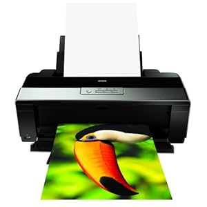
Several years when we bought our Epson R1900 printer, we also bought some Epson "premium" photo paper to go along with it.  While I still would not classify myself as a "serious printer", we recently learned a fair amount about printing in the series of posts dedicated to the topic.

One of the discussions centered on the quality of the paper you use.  I was fortunate enough to receive both 8.5x11 and 13x19 quantities of Red River's 68lb UltraPro Satin sheets for Christmas and cannot believe the richness of the colors being produced on this paper!  If you print ANYTHING at home, do yourself a favor and order a sample kit from Red River to try on your own printer.  It's one thing to say the quality of paper makes a difference, but it's entirely different to see it with your own eyes.

Tuesday, December 6, 2011

Triptych Printing Fun in Lightroom

Today I thought I'd share a few more features I recently discovered in the Lightroom Print module while producing this triptych featuring our feathered children, affectionately known as the "Fids" (aka, "feathered kids").  Here's the recipe step-by-step:
  1. First I created a new collection inside my "Print Copies" collection set titled "Birdie Birthday" and added the 3 processed images you see above (See Step #1 in this post for more info).
  2. With all 3 images selected inside this new collection, I clicked into the Print module and selected the "Triptych" Lightroom Template from the Template Browser.  Using the "Page Setup" button, I set an 8.5 x 11 page size in landscape format.
  3. Next, I used the Layout panel to define the Page Grid as having 1 row of 3 columns with a narrow space separating each cell as show in the screen capture to the right.  Once your images display in the cell grid you can use your mouse to reposition them within the cell.  To help separate them from the page I also added a 1 pt gray border around each cell using the "Stroke Border" option in the Image Settings panel.
  4. Now it's time to add the "Birdie Birthday" title.  To do this, I simply created a new text Identity Plate (See Step # 5 in this post for more info) using the bold, 36 pt Tempus Sans ITC font.  It seemed to fit the "birthday mood" :).
  5. Lastly, I wanted to add a brief caption under each cell in the triptych.  If you've been following these Lightroom posts over the last several weeks, you'd understand why my first thought was to use the "Photo Info" option and apply my Copy Name preset as was outlined in this post.  While it accomplished the goal, I discovered there's no way to customize the "Photo Info" font other than to adjust the size.  That's when I discovered this next trick.

    I knew I needed to get this image into another editor like PhotoShop in order to add my captions.  Unfortunately, there's no "export" from the Print module.  Instead, you can use the "Print to:" option from the Print Job panel and specify to output to a JPEG File rather than to the printer.  TA DA! 
  6. With my triptych exported to a jpeg, I opened the file in PhotoShop and added text captions below each cell matching the title font and style. After saving the file, I jumped back to Lightroom and imported the final product back into the "Birdie Birthday" collection to admire the finished product.
I was a little concerned that exporting to jpeg, editing the jpeg, and then resaving the file back as a jpeg again was going to cause some image degredation, but doing a side-by-side comparison of the finished product to the original images showed it held up pretty well.  Remember, you could always save the finished product to a format that isn't being recompressed each time, such as a psd or tiff.

That's all for this week.  If you find the time to give it a try, add links to your finished products in the comment section below.  Would love to see the results.

Until next time, keep click'n.
-Ken

Tuesday, November 29, 2011

Creating a 2 Line Identity Plate for Lightroom

Last week we outlined how to turn your favorite images into posters using Lightroom.  One of the steps in that process was to create a new Identity Plate to use as the title for your poster.  For Mac users, a Option + Enter should give you a new line of text and all is well.  Unfortunately for PC users such as my self, there is currently no means of creating a 2 line text Identity Plate.  Thanks Adobe.

Luckily you can also use a graphic for your Identity Plate and that's exactly what you'll need to do if you want more than one of text and use a PC.  Lightroom supports jpg, png, gif, bmp and tif file types as Identity Plates.  Because there are no vector based image types supported, you should try to create the Identity Plate image the exact size you want it to appear on your poster.  If you start to re size the Identity Plate graphic on your image, you will likely lose the crispness of your original text.

I used my ancient copy of Adobe PhotoShop CS to create my title, but most any graphics application (PhotoShop, Gimp, etc.) should do the trick.  Here's how I created mine:
  1. Create a new transparent file of the dimensions as you'll want it to appear on your poster.  I used 7" wide by 0.5" high.
  2. Select the text tool and set your desired font type and size.  In my example, I used the Trajan Pro font - 14pt for the first line of text and 9pt for the second.
  3. For "creative effect", I added an additional space between each letter and 2 spaces between words.  I also centered the text to make it easier to center the image on the final poster.
Here's what the image looks like in PhotoShop.


Once happy with the graphic, I saved it as a png and preserved the transparent background.  Back in Lightroom, return to the Print module and scroll down to the Page panel.  Click the drop down arrow in the lower right corner of the Identity Plate section to browse to your newly created graphic.

And there you go.  Whether you need to use this as a workaround for a multi-lined poster title on the PC or you want to create an elaborate graphic to include on your prints, you now have another handy tip in your printing toolbox.

Until next time, keep click'n.
-Ken

Tuesday, November 22, 2011

Creating a Poster Print Template in Lightroom

With just a few simple mouse clicks, you can produce an attractive poster layout right within Lightroom.  Here's how:
  1. Select your desired image and click into the Print Module.
  2. Use the "Page Setup" button in the lower left to select your paper size and page orientation.
  3. Select the "1 Large With Stroke" print template from the Template Browser panel.  In my above example I modified the Stroke color to a medium gray from the Image Settings panel.
  4. In the Layout panel, adjust the margins to your liking.  Typically you'll want to leave a larger margin on the bottom to allow room for your title.
  5. To add a title to your poster, you will need to create a new Identity Plate containing the text you want to appear.  Once you've selected your new Identity Plate, be sure the "Identity Plate" option is checked.  Now you can click/drag and reposition the title under your photo.  Tip: The "handles" on the box surrounding your Identity Plate are located on its center.  By turning on the "Show Rulers" and "Show Guides" options you can click immediately next to the handle and see it's corresponding position on the horizontal or vertical ruler.  You can use this tip to be sure your title is appropriately centered beneath your photo.
That's it!  A few simple mouse clicks and you're now producing posters of your very own photos!

If you're a PC user like me and you're struggling with producing 2 lines of text for your poster title within Lightroom's Identity Plate editor, you aren't alone.  Stop back next week and I'll show you how I was able to produce a 2 line Identity Plate.

Lastly, don't forget to save your new layout as a User Template (click the "+" symbol to the right of the Template Browser).  Now you have your own poster template just a mouse click away.

Until next time, keep click'n.
-Ken

Tuesday, November 15, 2011

The Test Print Continued

Last week we continued an overview on the knowledge I've acquired on my journey toward producing a quality print at home.  If you're coming to this post late in the game, you can catch up by reading the following posts:

At the end of last week's post, I promised to share how I added the "Brightness" label next to each of the cells in the test print as shown below.


If you followed along with the video tutorial I shared in last week's post, you'd have noticed that once the print hits the tray you really have no immediate way of telling which cell matches up with which virtual copy.  Here are a few tips I've employed that should help alleviate any confusion.
  1. Create a separate "Print Copies" Collection Set to hold your print adjusted images. Inside the "Print Copies" collection set, create a new collection for your current image.  For my example above, I added a collection called "Moulton's Pride".
  2. Add your original processed image to the collection you created in step 1.
  3. Create 3 virtual copies of the original within that same collection using the Ctrl + ' key shortcut.
  4. Select the first virtual copy and navigate to the Metadata panel in the Library Module.  Enter "Brightness = +20" in the "Copy Name" field. 
  5. Press "D" to enter the development module and increase the Brightness Slider another 20 points over your original setting.
  6. Repeat steps 4 and 5 for the other virtual copies increasing the brightness another 10 points over the prior image.  Again, I varied the brightness on my virtual copies by +20, +30 and +40 from the original image.  I may end up refining this with more experience as should you.
  7. Select all 4 of the images in your collection (original + 3 virtual) and then click on the "Print" module option.
  8. If you're not already viewing your selected images in the 2x2 template, select the "2x2 Cells" template from the Template Browser.
  9. As my selected images are in a landscape orientation I'm going to check the "Rotate to Fit" option under the Image Settings to utilize as much of the page size as possible.
  10. Scroll down to the "Page" panel.  Find and check the "Photo Info" option and then select the "Edit" option from the drop down to the right of the option.  This will bring up the Text Template Editor as shown below.
  11. Find "Copy Name" in one of the drop downs under the Image Name section and click insert or simply type the text into the text box as show in the screen shot.
  12. From the "Preset" drop down, select "Save Current Settings as New Preset" and title it "Copy Name".


That's it.  Now any time you want the text inside the "Copy Name" meta data text box to appear on your print, simply click this newly created Photo Info template from the list.

Once you've identified which of your images produces the best quality print, either use one of Lightroom's features to identify the specific image copy (set a color label, etc), or simply remove all of the other copies of the image from that collection.  If you are printing to different types of media you may need to become a little more elaborate with your organization structure or meta data to help you match the correct adjusted image with the media to which you'll be printing.

Stop back next week we'll review how to use Lightroom to produce an attractive, ready to hang poster from your favorite image.

Until next time, keep click'n.
-Ken

Tuesday, November 8, 2011

The Test Print - Step 4 Toward Quality Prints

Over the last several weeks I've been sharing what I've learned as I set out to tackle the art of printing while my journey down the photography highway continues.  If you've missed the prior posts, you can quickly get caught up with the links below:

As the intro suggests, I'm by no means an expert printer.  I do, however, have a strong desire to understand how I can optimize my post processing techniques to be able to output the best quality prints possible.  With that goal in mind, why not jump in and learn how to make quality prints on our own equipment and share my findings along the way?  To that end, I hope these posts can help you in some way or solicit additional knowledge transfer from the readership.  If you're reading this and have tips, tricks or resources you've found helpful, please use the comments section below to benefit the rest of us. Thank you.  Now on with the show...

After implementing each of the above steps, I've come to appreciate that while my prints were getting better, I was still suffering from what turns out to be a very common problem - dark prints.  The finished product hits the paper tray, the colors look good, the image is nice and crisp, but when you compare it to what you see on screen you're left underwhelmed.  This may be a reiteration of the obvious, but it warrants pointing out none-the-less.  The image on your nice bright display is back lit while the printed output is not.  This is a very important concept to tattoo onto your brain.  The intended media for your output will play a critical part in how you process the image, particularly when it comes to brightness.

Upon researching the cure for the "dark print" issue, I've found two common threads of advice:
  1. Reduce the brightness of your display.  Most manufacturers have the default brightness levels set far brighter than they really need to be.  As a result, you will tend to set the brightness levels of your processed images lower than optimal for printing.  If you opt to invest in a set of more advanced calibration tools, such as X-Rite's ColorMunki, you'll be able to identify and adjust for brightness issues between your display and your printer.  If you're "eyeballing" it, simply experiment with turning down the brightness on the display until the adjustments you're making in post processing are more accurately represented in print.
  2. Make a test print showing your image with multiple brightness settings and then pick the one that looks best for your final print.  This is a tip I read over on Adobe PhotoShop Lightroom Killer Tips by Matt Kloskowski.  Rather than reinvent the wheel, I'll just share what he's already done in a nice video tutorial.  The actual tutorial begins around the 1 minute mark.
The image above is a screen shot of my test print based on Matt's advice from the video tutorial.  THIS is why I recommended buying smaller sheets of the paper stock you will use for your final output.  I'd much rather burn up 1 sheet of 8.5 x 11 with my 4 test prints than to go through as many as 4 sheets (and ink) of a larger, more expensive sheet to accomplish the same thing.

As you may have already come to realize, I've adopted the 2x2 print template method into my printing workflow.  I've also dialed down the brightness on my main display some, but not to the level that would match my print and here's why.  The "Print" is not my usual intended output.  If I dim down my display to the point that it matches my printed output, now all of the images I publish online (to an audience of users with bright, back lit displays) will likely look washed out!

To illustrate the point, take a look at the screen shot of the test print above.  Keeping in mind that our displays are very likely not calibrated to the same specifications or share the same brightness, I'm guessing that the best looking image on your screen would be the one in the top right.  With the label of "Brightness = 0", this is the image as I've processed it to look best on my display without any adjustment for printing.  On the printed test page, however, the image labeled "Brightness=+20" (bottom right) proved to be the most attractive option. 

This post ended up being a little longer than most, but hopefully it will help you to save you ink, a few trees AND your sanity.  Remember that tattoo we put on your brain if you remember nothing else.  The intended media for your output will play a critical part in how you process your image.  Stop back next week and I'll add to Matt's "2x2" tip by telling you how I got those brightness labels to appear next to each image in my test print.

Until next time, keep on click'n.
-Ken


Tuesday, November 1, 2011

ICC Color Profiles - Step 3 Toward Quality Prints

Over the last couple of weeks we've discussed the importance of screen calibration and paper selection in your quest for quality prints.  Today, we're going to talk about ICC Color Profiles and how to leverage them within Adobe Lightroom 3.

First, what the heck is an "ICC Color Profile"?  The short answer is that it is instructions for a specific device on how to render colors correctly.  For example, most paper manufacturers, including Red River Paper, have gone through the process of printing on their papers with popular printer models to understand how well the paper and ink pigments play together.  If they find variances between what they expected and what they received in the print test, they can then develop an ICC color profile to adjust for those differences.  Make sense?  If you'd like more information on ICC profiles, this is a pretty good resource.

Alright, so you have your favorite paper loaded into your printer, you've downloaded the correct ICC color profile, but how do you get Lightroom to use it?  Generally there are two simple steps necessary to have Lightroom instruct your printer to use the profile.

  1. In the Print Module within Lightroom, scroll down to the "Print Job" panel.  Under the Color Management section you will see an option for "Profile".  Use this option to locate and select the ICC color profile on your computer.
  2. In addition to telling Lightroom to use the profile, you may also need to instruct any print driver software to allow the application to deal with color management.  On our Epson R1900, this means selecting the printer properties, clicking the Advanced tab and selecting the options as seen below.

With these 3 new tools in your arsenal - screen calibration, quality paper of various sizes, and ICC Color Profiles - you're now ready to start your journey into the world of print.  The Print module within Lightroom 3 has a nearly overwhelming number of bells and whistles and over time we'll learn about them together. 

Next week we'll start discussing the "test print" process and what I've learned to help mitigate the amount of trial and error (aka wasted paper and ink) required to produce output ready to hang on the wall.

Until next time, keep on click'n.
-Ken

Friday, October 28, 2011

What's Your Favorite Photo Paper?

In Tuesday's post, I referenced Red River Paper's sample kits as a great way to get your hands on a nice selection of different papers on which to experiment.

What's your favorite paper for printing at home?  Do you know if the vendor also offers sample kits for experimenting?  Drop us a comment below with your suggestions.  We'd love to hear from you.

Tuesday, October 25, 2011

The Proof is in the Paper - Step 2 Toward Quality Prints

Last week we covered the importance of screen calibration in the printing process.  Until you know you're getting consistent colors on your display from image to image, don't bother wasting your ink on inconsistent prints.  Assuming you have your display color under control, the next step is to look at the paper on which you're going to print.

When we purchased our Epson R1900, we had visions of wide format prints (13"x19") hanging all over our walls so we also purchased a 20 pack of Epson's 13x19 Premium Photo Glossy paper.  I remember thinking at the time, this is rather expensive stuff at nearly $3 per sheet.  Obviously we didn't always want to print 13x19 so we picked up some 8.5x11 photo paper at the local Wal Mart for the rest.  Well, guess what.  The same image printed on Wal Mart's bargain brand 8.5x 11 photo paper looks nothing like the image printed on the Epson paper!

I've come to appreciate that printing is an iterative process.  By that I mean you're going to burn through some paper and ink before you're happy with the results and proceed to the "final print".  That being the case, it's time to go paper shopping.  The mistake I made in the beginning was to have quality paper for our final print and something less for "screwing around".  This time around I decided to order a sample kit of papers from a well known supplier - Red River Paper.  With a  few sheets of each of their different types of inkjet papers, I can now experiment with what paper I prefer for the types of images I print.  Once I've "dialed it in", I'll be placing another order for larger stock of that type as well as smaller sheets for use in the testing process.

Next week we'll review ICC Color Profiles, what they are, and how to use them within Lightroom.

Until next time, keep on click'n.
-Ken

Tuesday, October 18, 2011

Screen Calibration - Step 1 Toward Quality Prints

When considering how to get the best quality output from your printer, you may not put screen calibration at the top of your to do list.  Why is it so important?  Well, if you stop to think about the print process, the end goal is to try to replicate on paper what you're seeing on your display.  If you can't rely on your screen to produce consistent colors from one image to the next, every new print job will be a new exercise in trial and error.

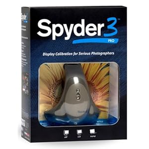
There are a ton of products available for calibration.  Some, like Datacolor's Spyder 3 Pro, target getting consistent colors on your display. Others, like ColorMunki Photo, offer more comprehensive screen and printer calibration solutions. 

Obtaining quality prints from your printer is a game of understanding and managing the variables involved.  Getting consistent results from your display via screen calibration is a great place to start and eliminate one of those variables.

Tuesday, October 11, 2011

Learning to Print in Lightroom

It's an age old dilemma.  Why don't my prints look like what I'm seeing on my display?  If you've gone down this road in your own photography journey, you know exactly what I'm talking about.  For a long time now its been something that's weighed on my mind - How do I tweak my post processing to get the best print results?

Well, like most things in life, the answer is to invest more time in figuring out what works and what doesn't.  There's no such thing as a "free lunch". :)  When selling prints from my web site I've always leveraged Mpix.com for order fulfillment. This usually means that when I make an image available for purchase, I myself will order a smaller print of that image to be sure everything comes out alright on paper.  This can end up being a time consuming and rather expensive trial and error process.

My wife and I have an Epson R1900 printer that we got back in 2008.  I've only recently replaced a few of the ink cartridges so that tells you just how much printing we've done.  Over the next several weeks I'll be diving into the world of printing and hopefully learning (and sharing) some helpful tips along the way.  If you are interested in learning more about printing or have experiences in that area you'd be willing to share, please stop back each Tuesday over the coming weeks and we'll see if we can't figure this thing out together.

Until next time, keep click'n.
-Ken